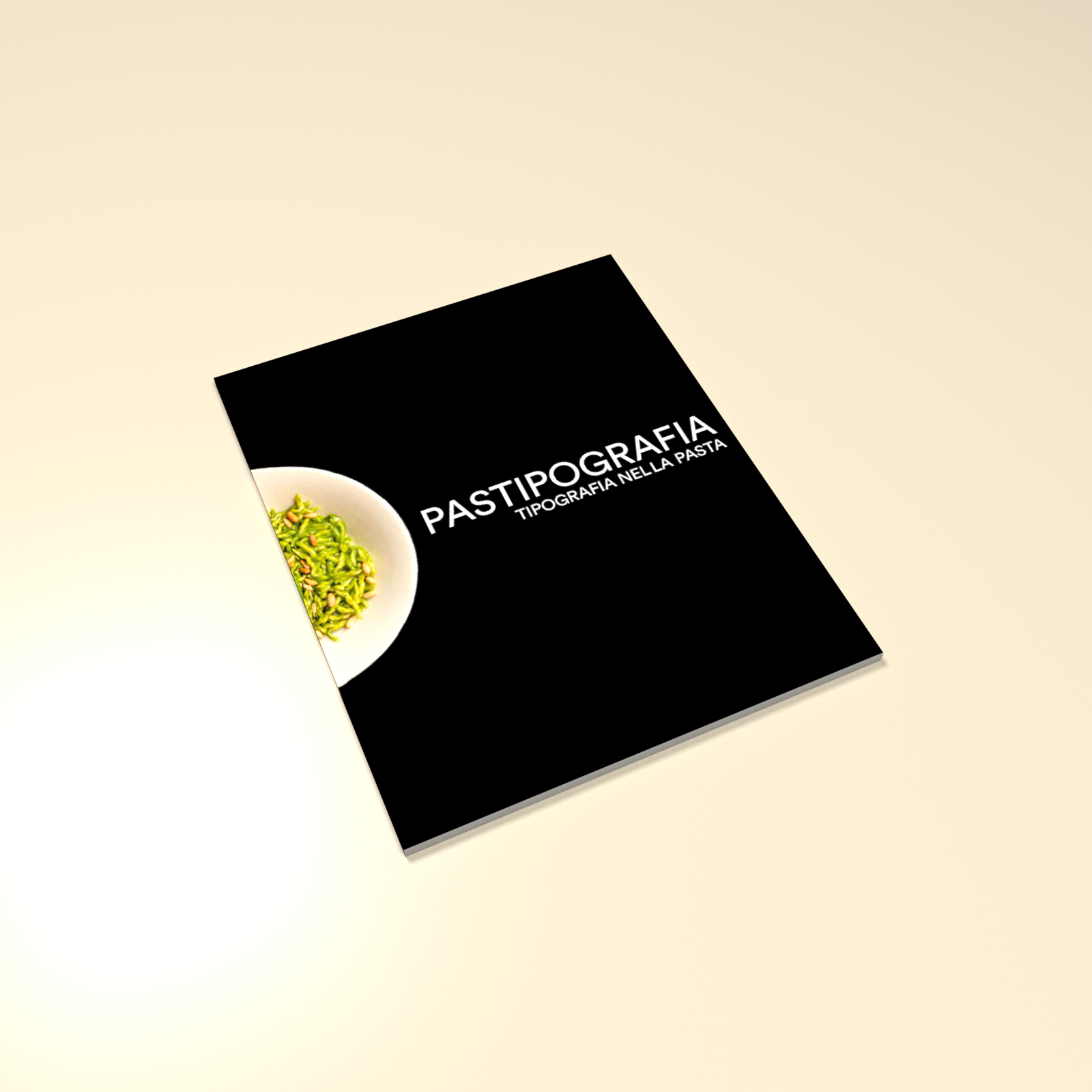
Pastipografia
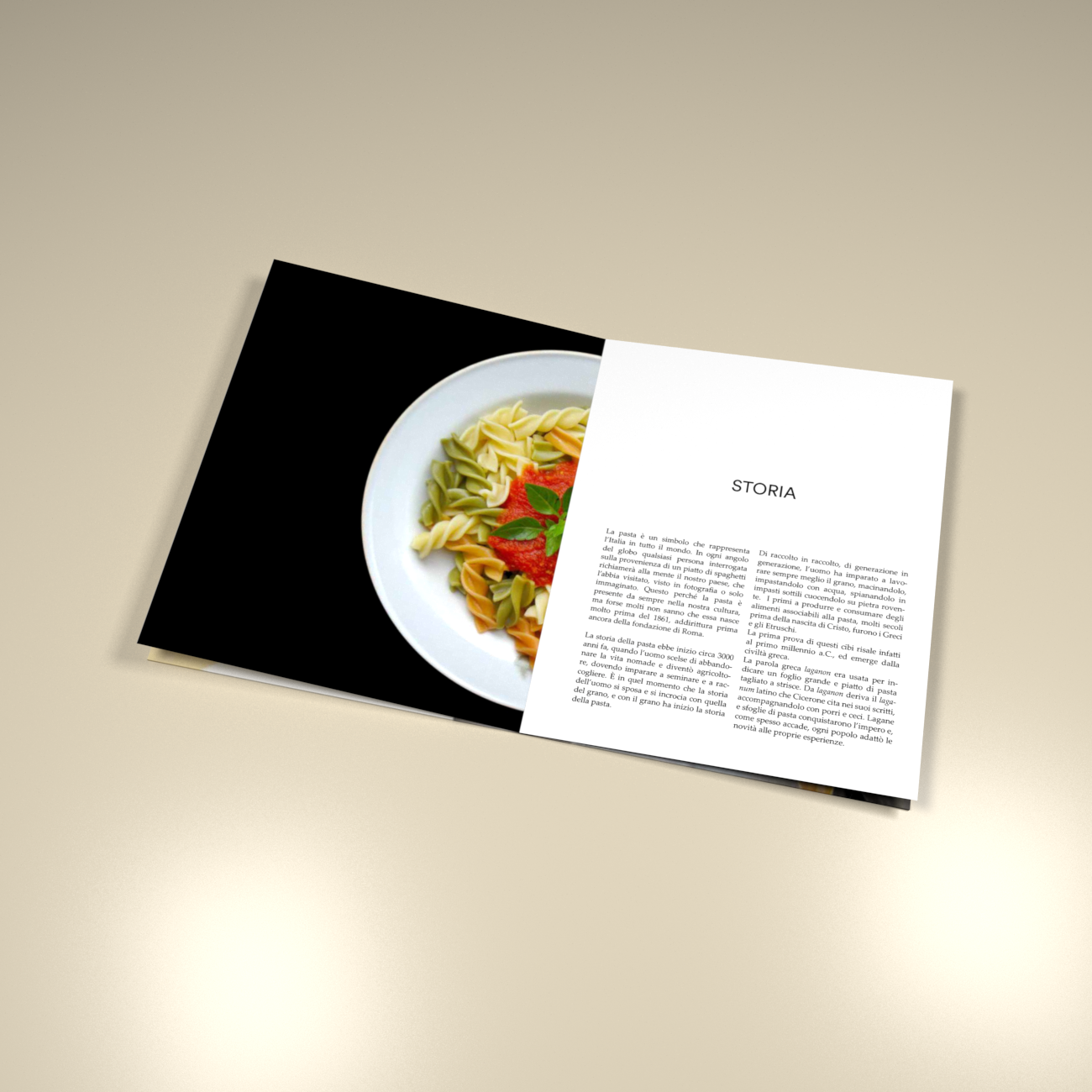
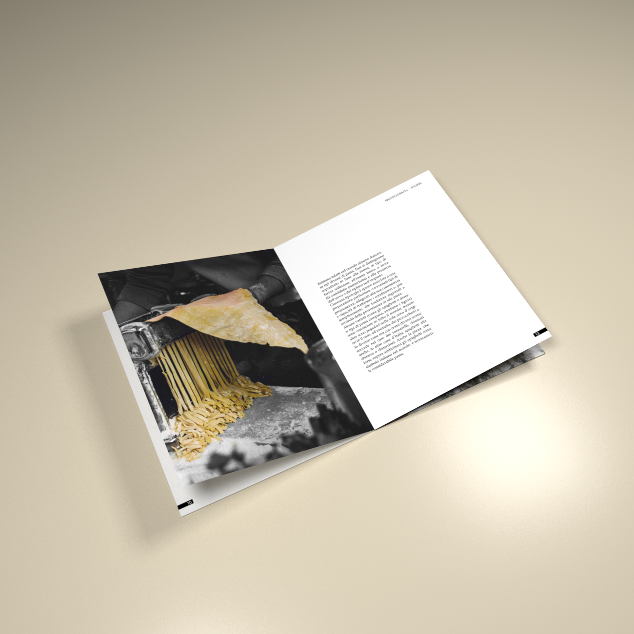
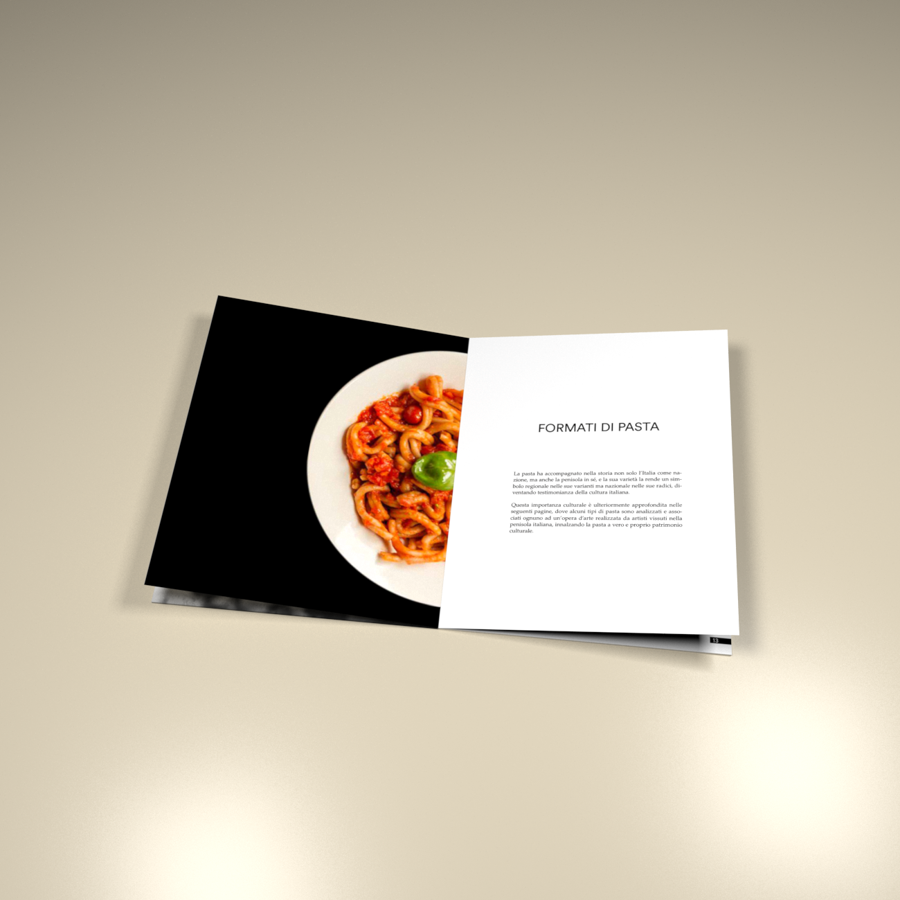
graphic design, editorial designThe brief requested to produce an editorial artifact to narrate the history of typography (but not only) in a certain sector. I picked the pasta topic: I divided the publication in three parts. The first one about the history of pasta, the second showing the different type of pasta available, and the third one analysing the packaging and the typography of the most famous brands of pasta, and their logos.
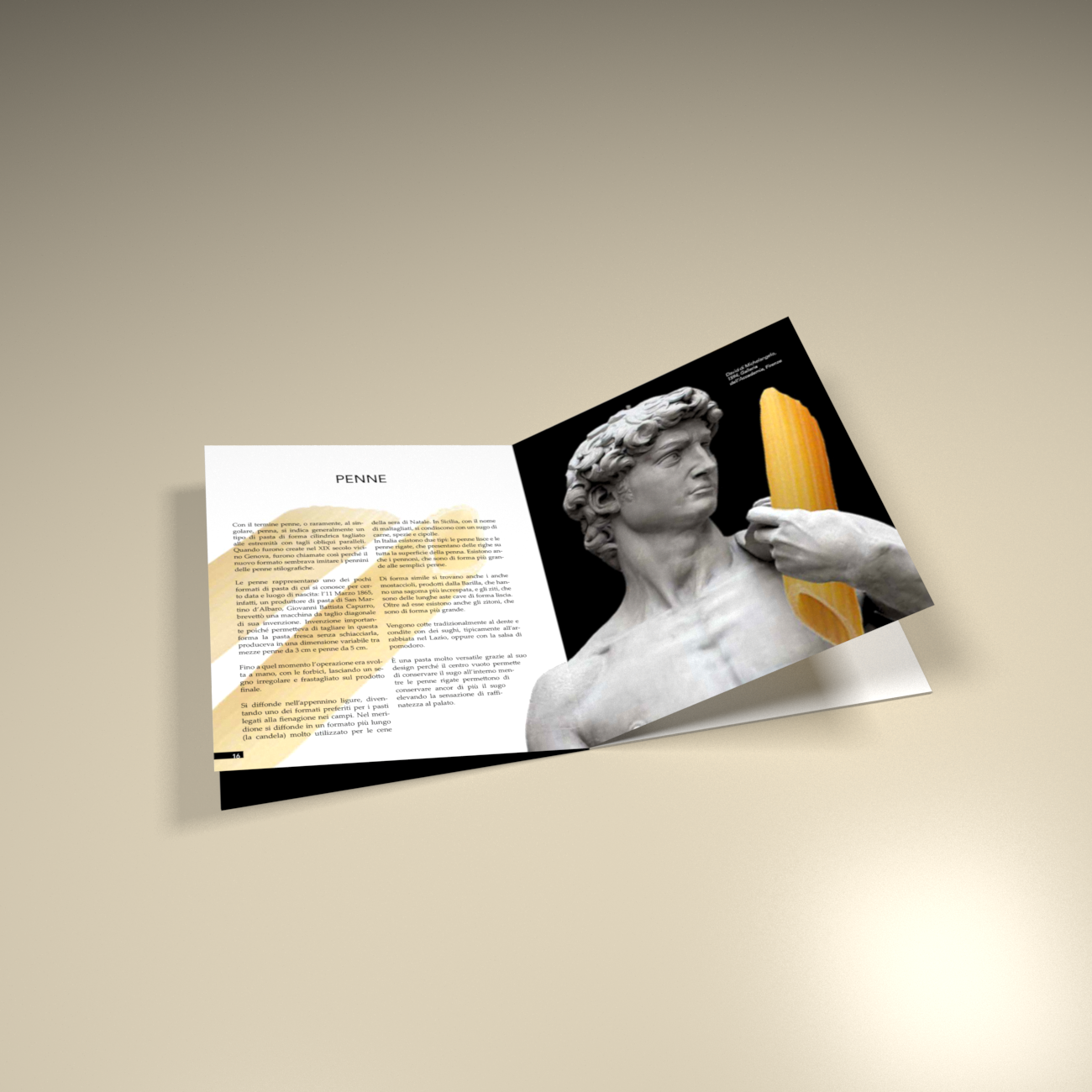
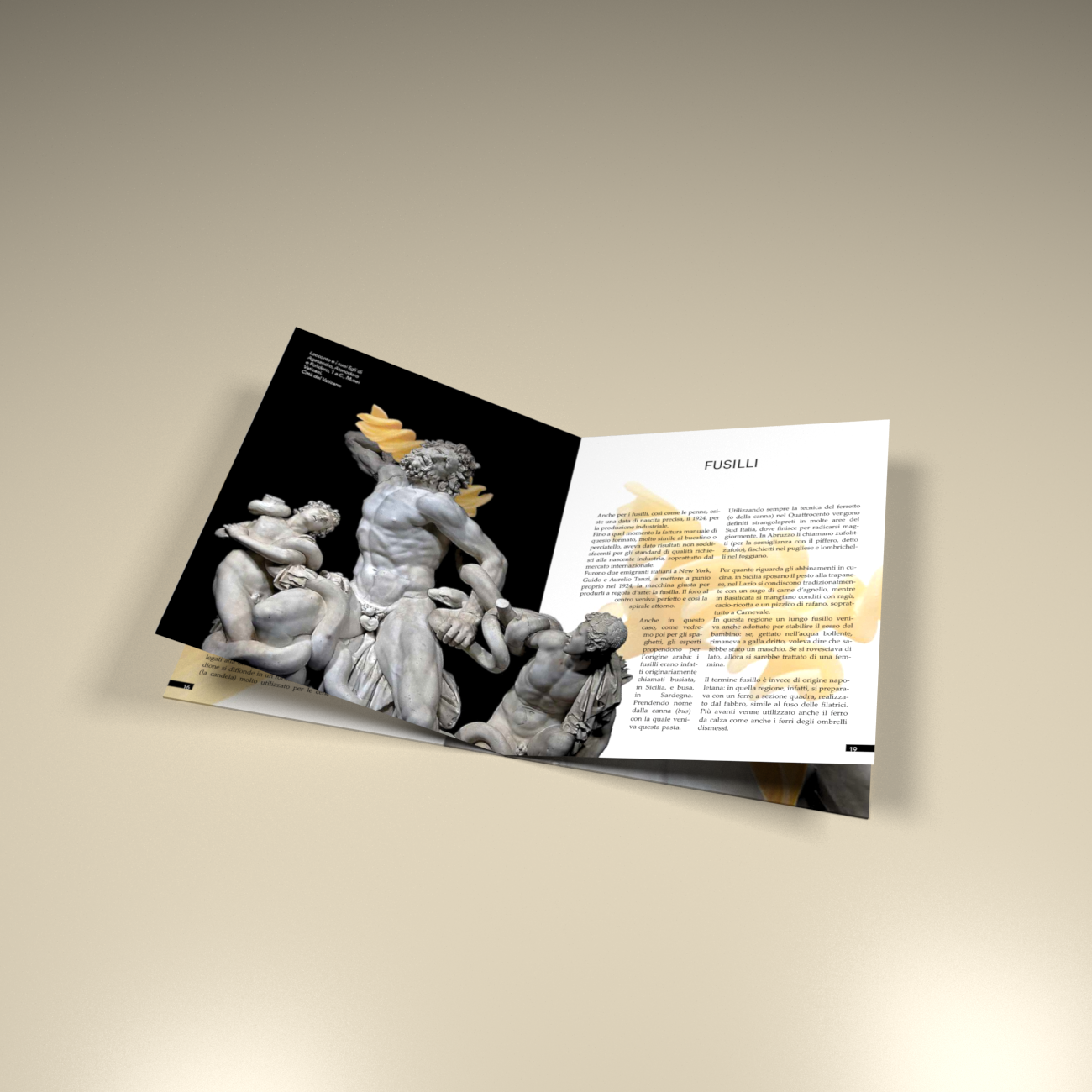
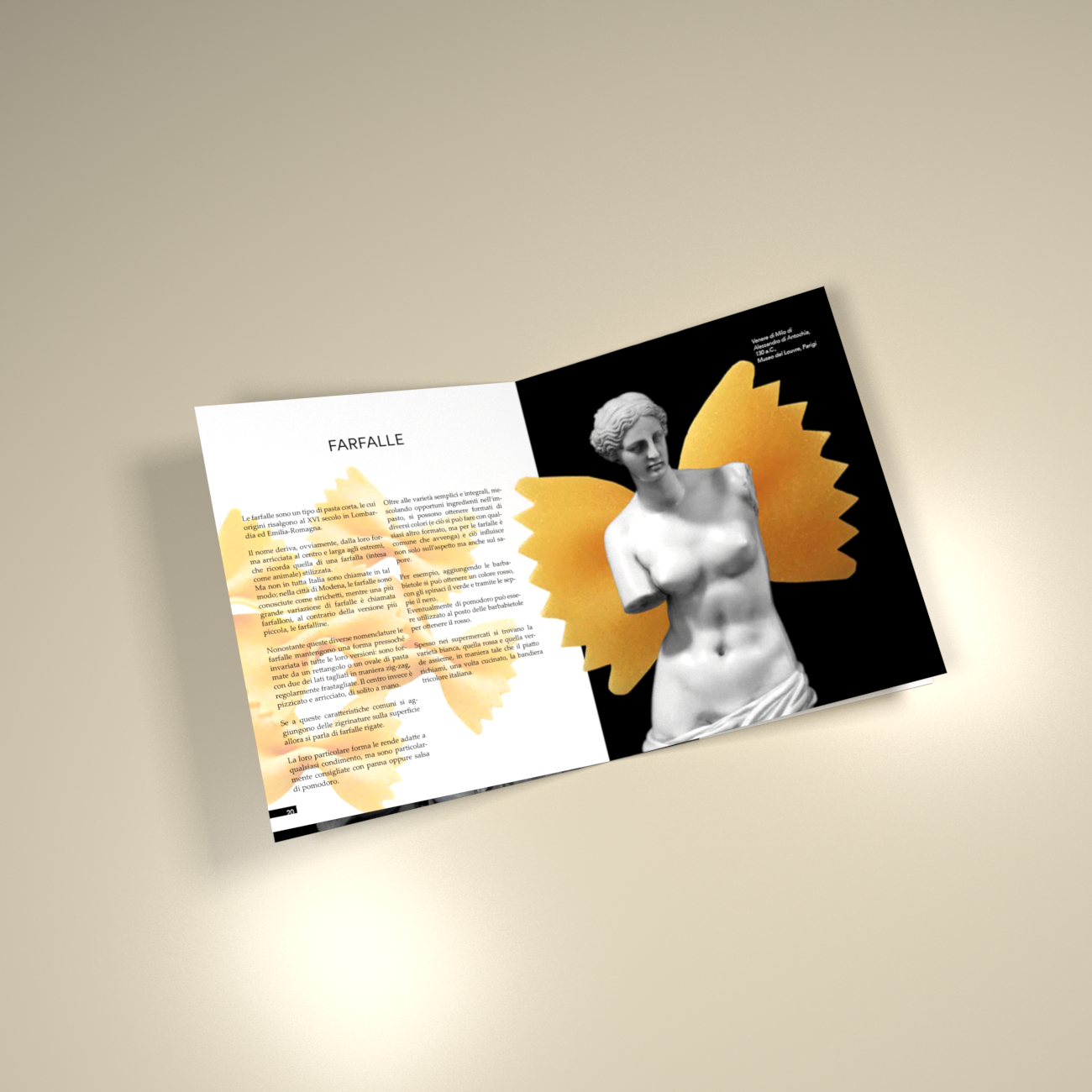
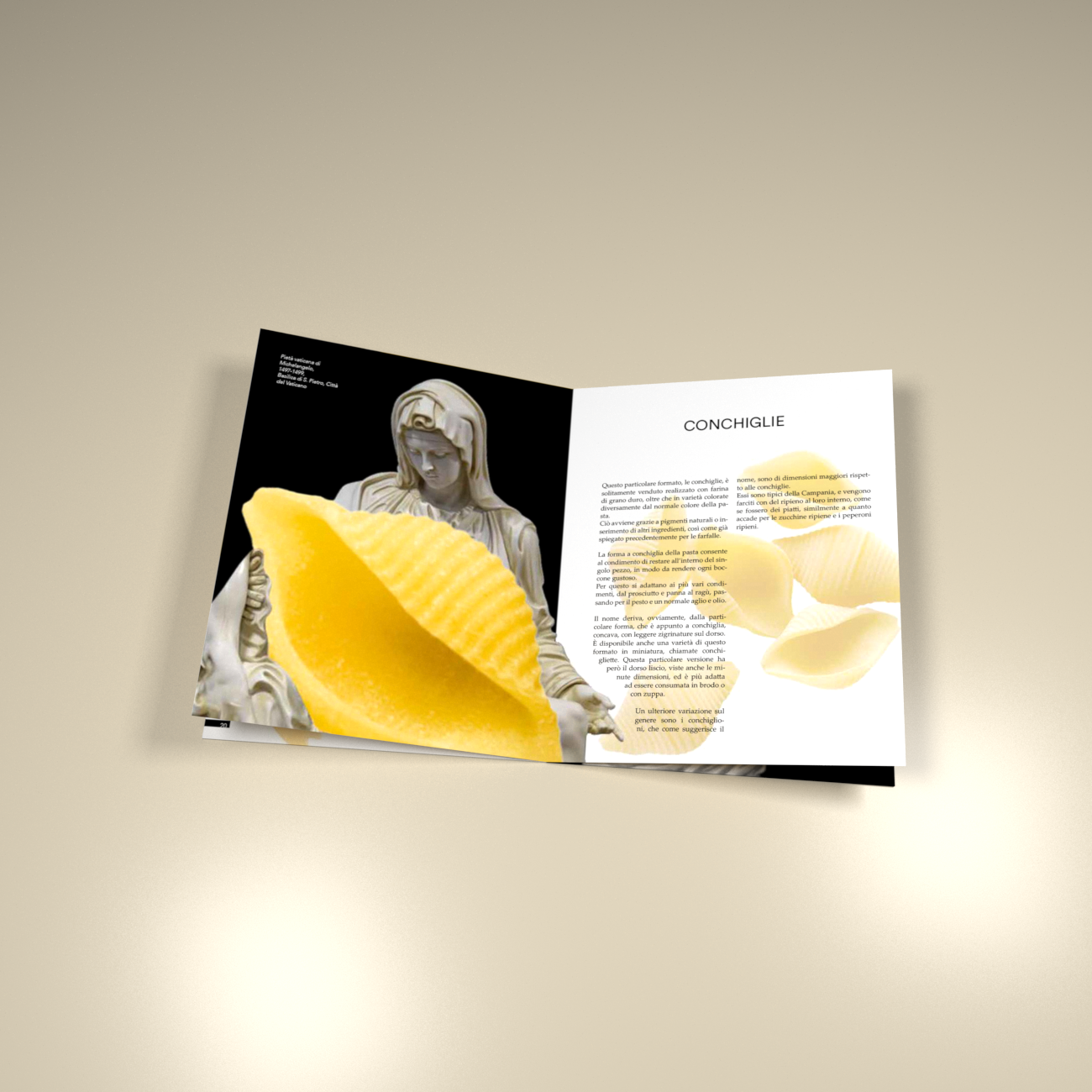
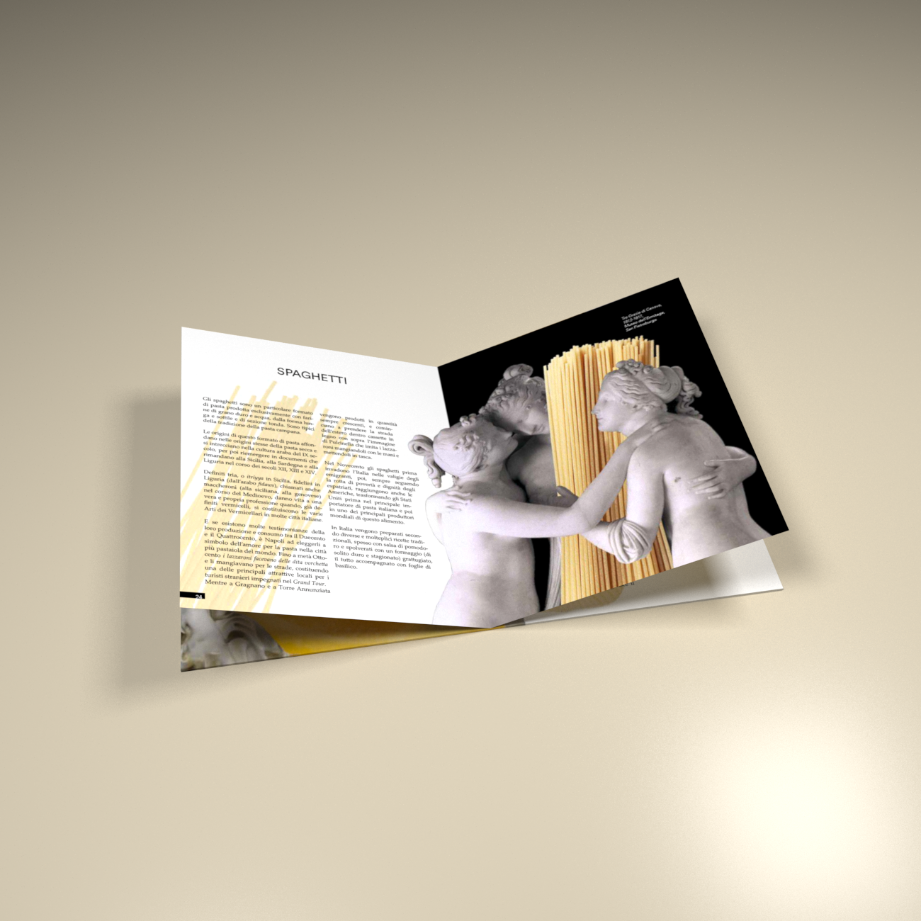
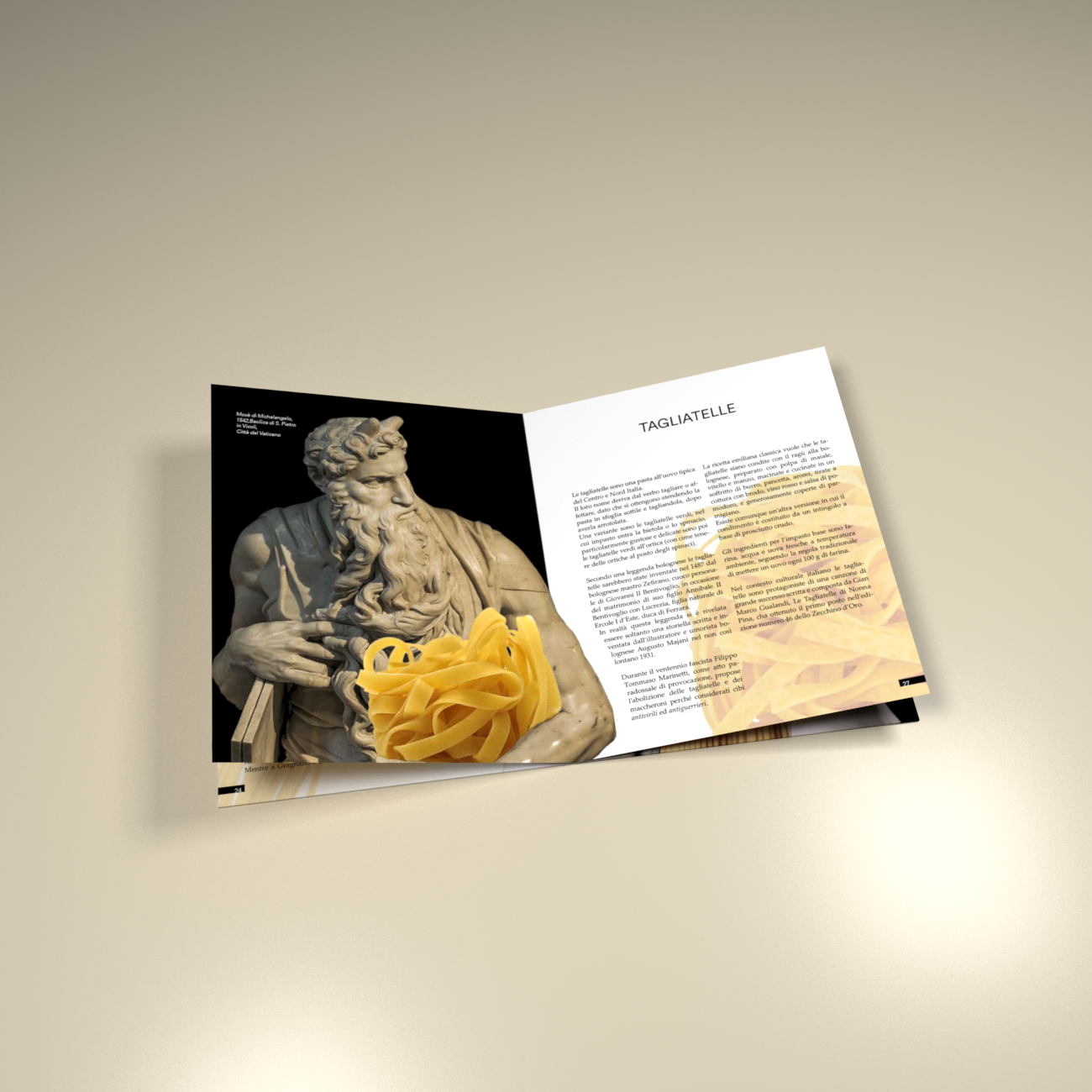
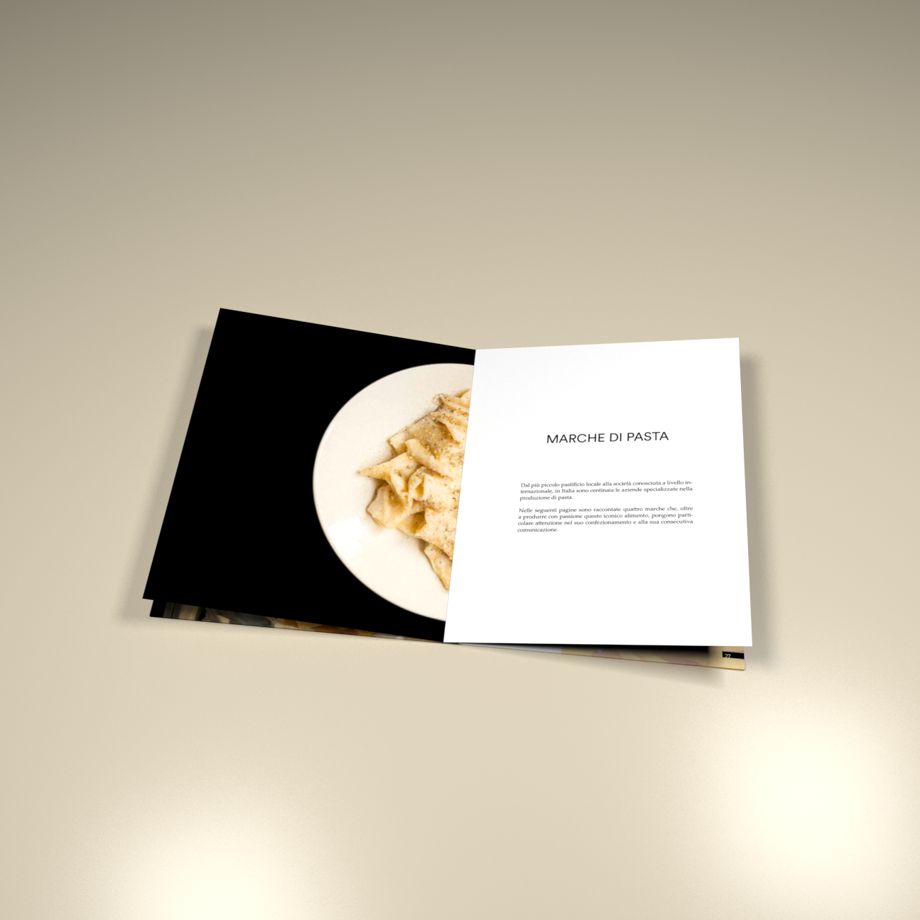
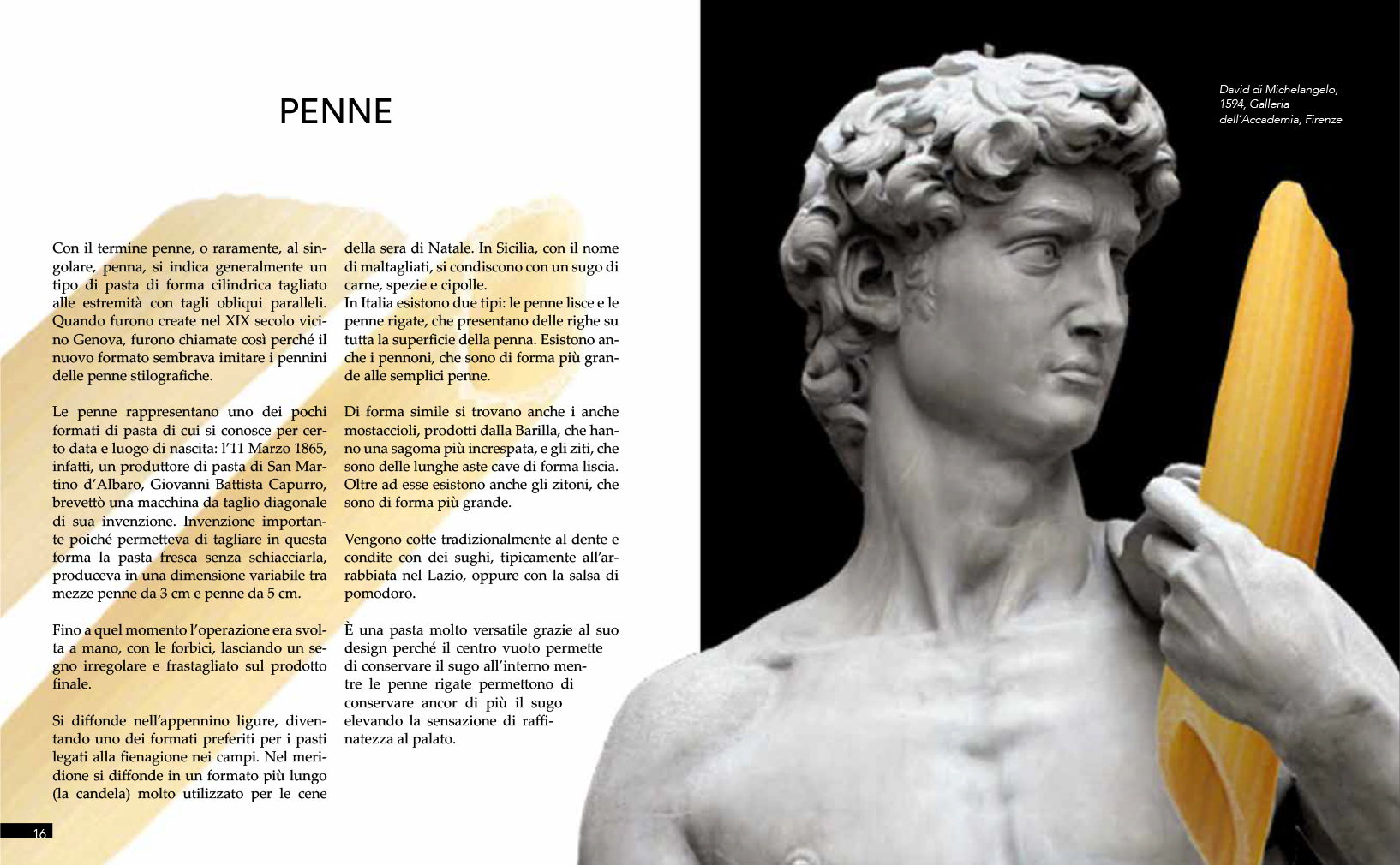
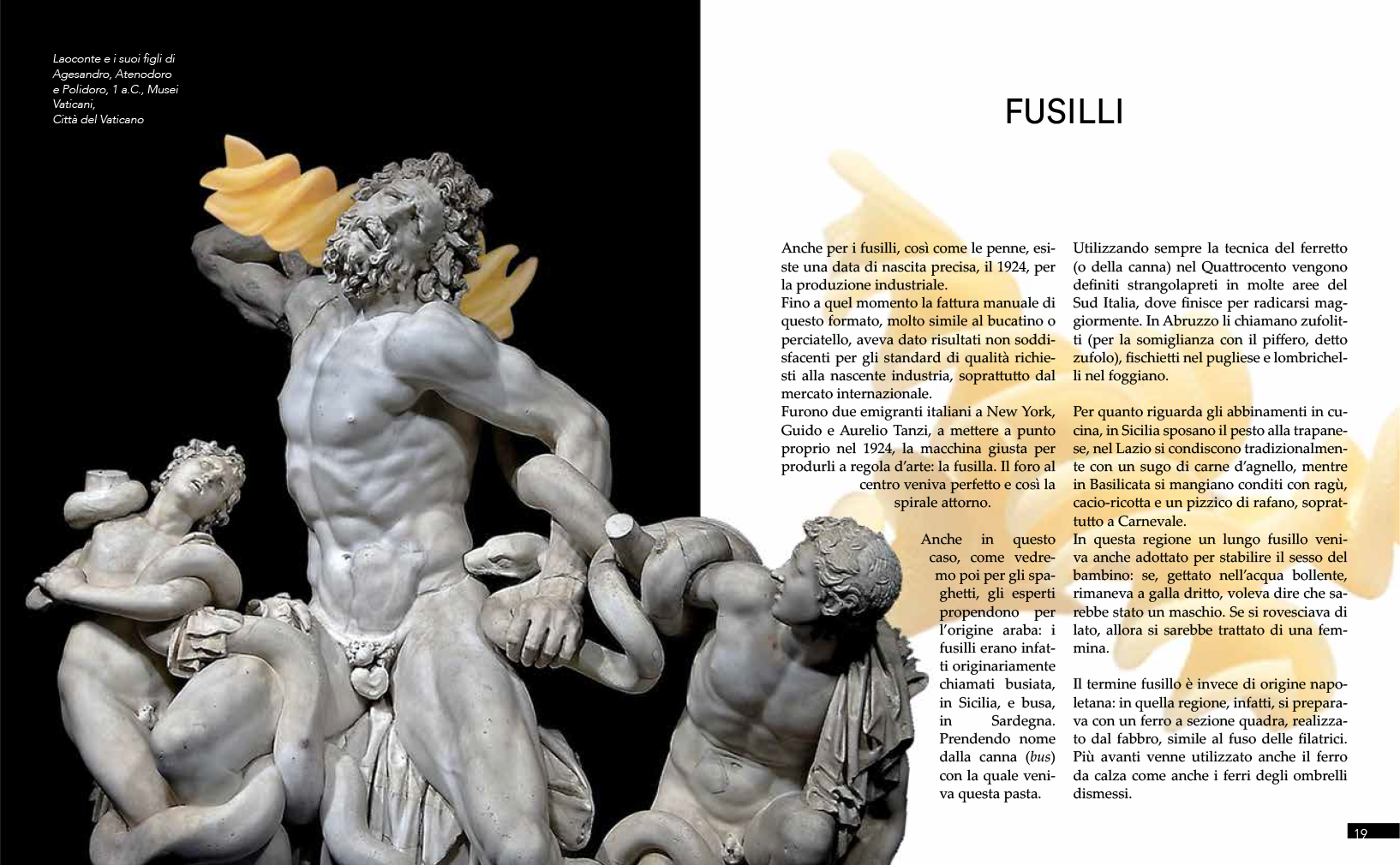
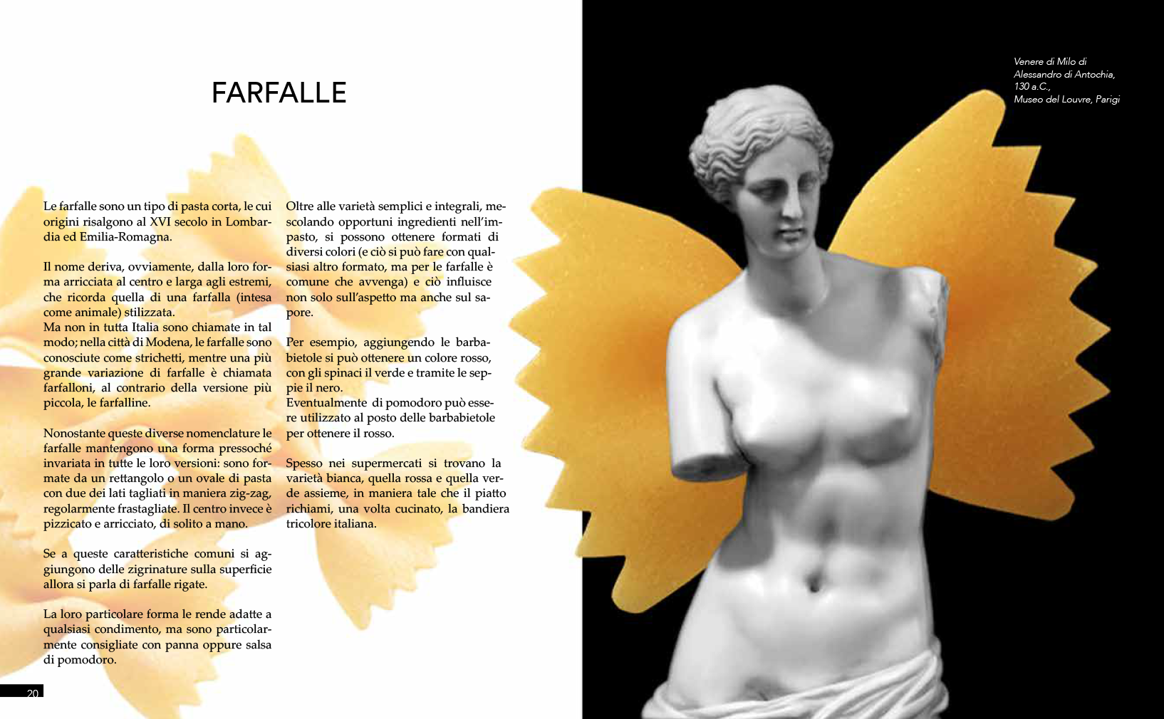
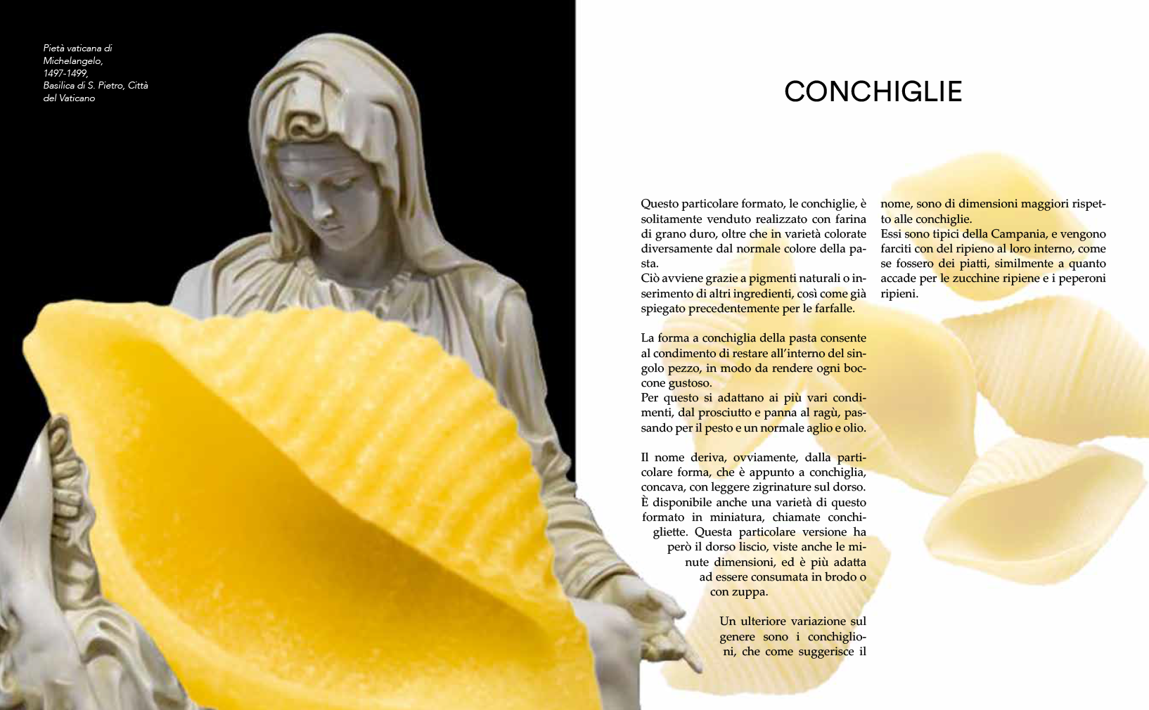
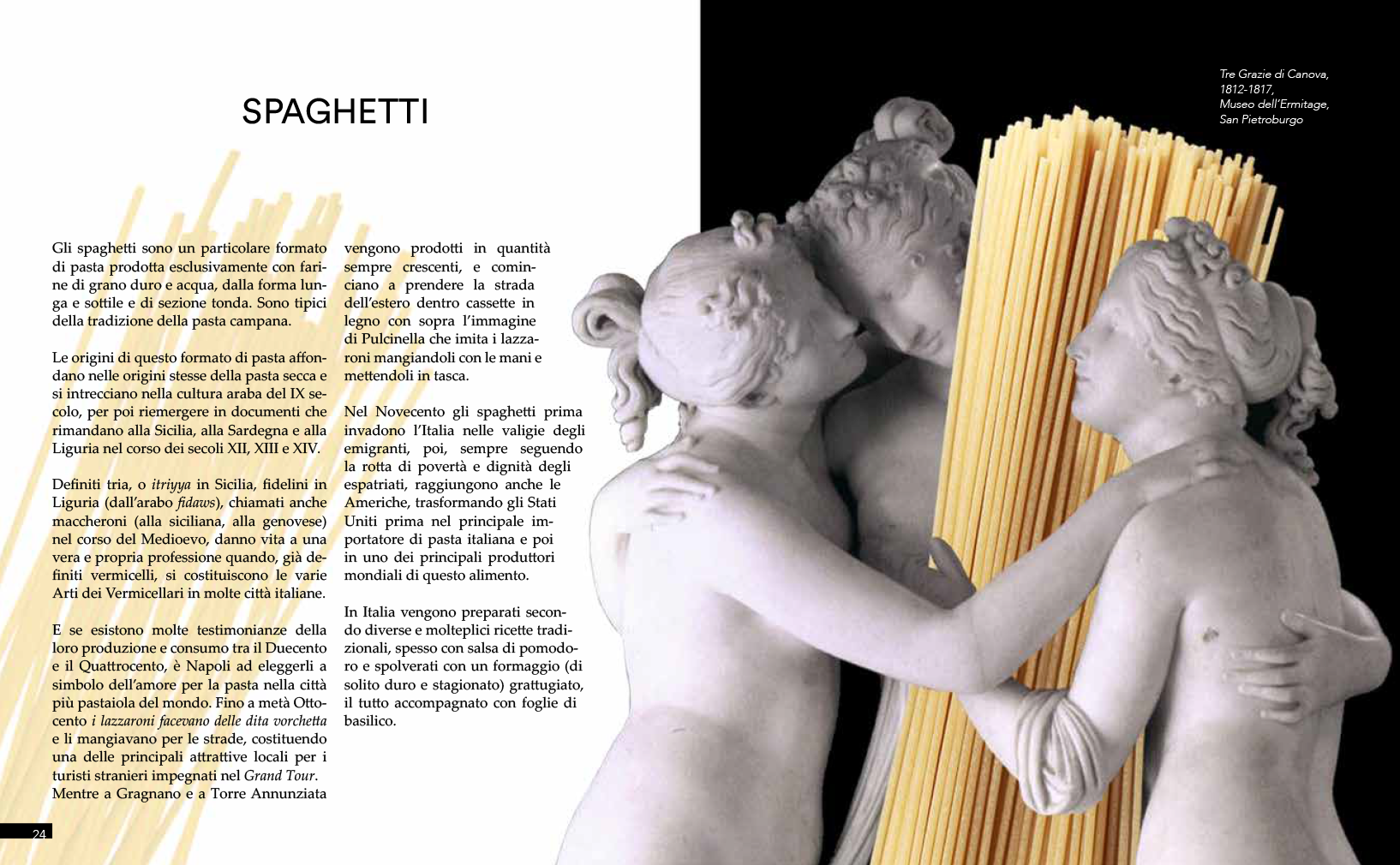
For the middle section I created some graphic mix (with Adobe Photoshop) between famous sculptures and pasta types, to communicate the importance of pasta in the italian culture and the “artistic” respect that italians pay to this ingredient.

Course
Politecnico di Milano
Facoltà di Design della Comunicazione
(Communication Design)
AA 2018 / 2019
Typographic Design
James Clough
Beatrice D’Agostino (assitant)